Congressional Calendar

K&L Gates

Creative Project Lead

Project Overview:

Project Context

K&L Gates' Public Policy and Law practice had produced a small, business-card-sized trifold calendar annually for years. With a new platform agreement in place with Ceros, the practice wanted to make the calendar more accessible by bringing it online as an interactive digital experience — while still needing a printed piece for distribution to clients and event attendees.

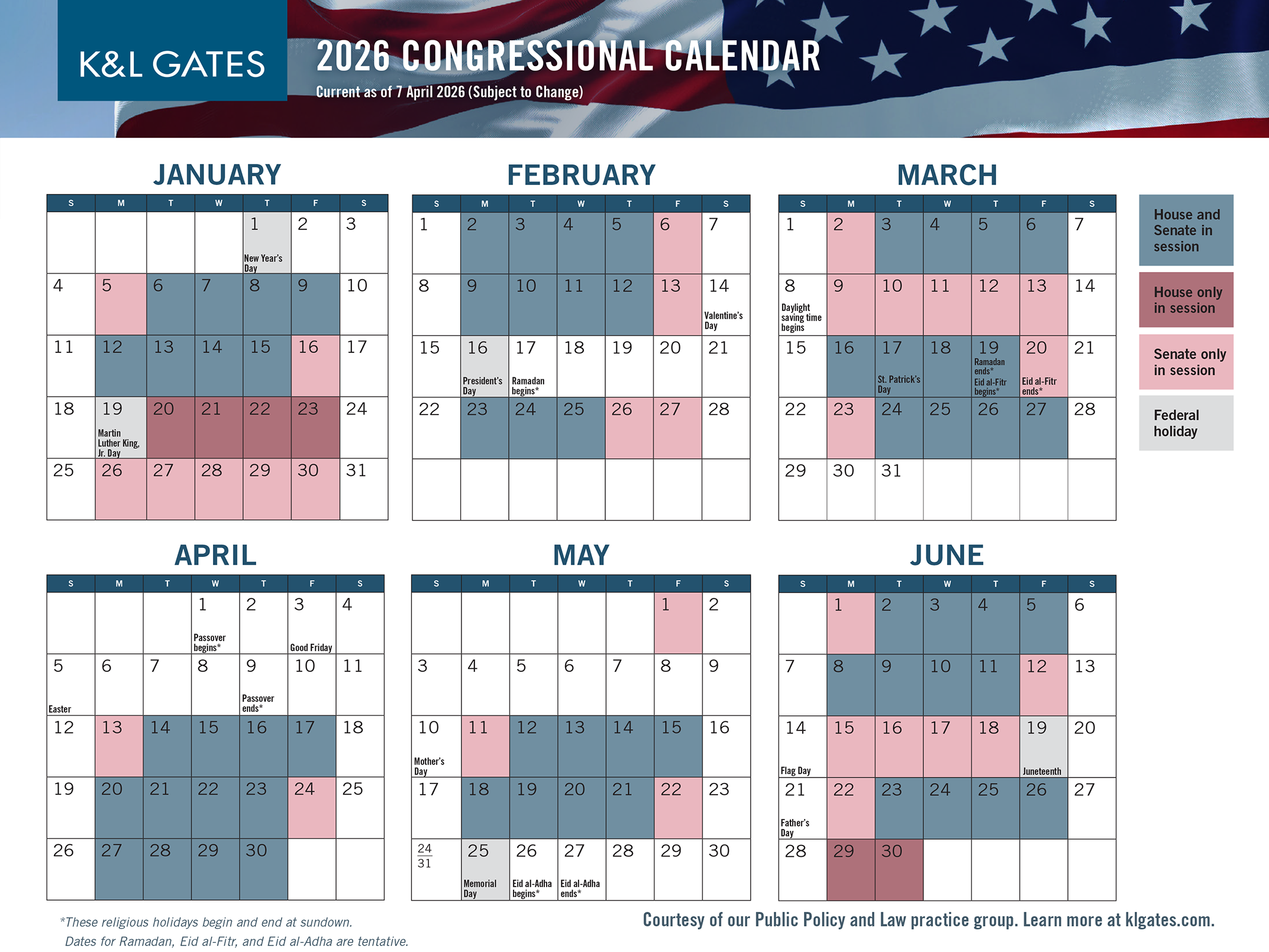
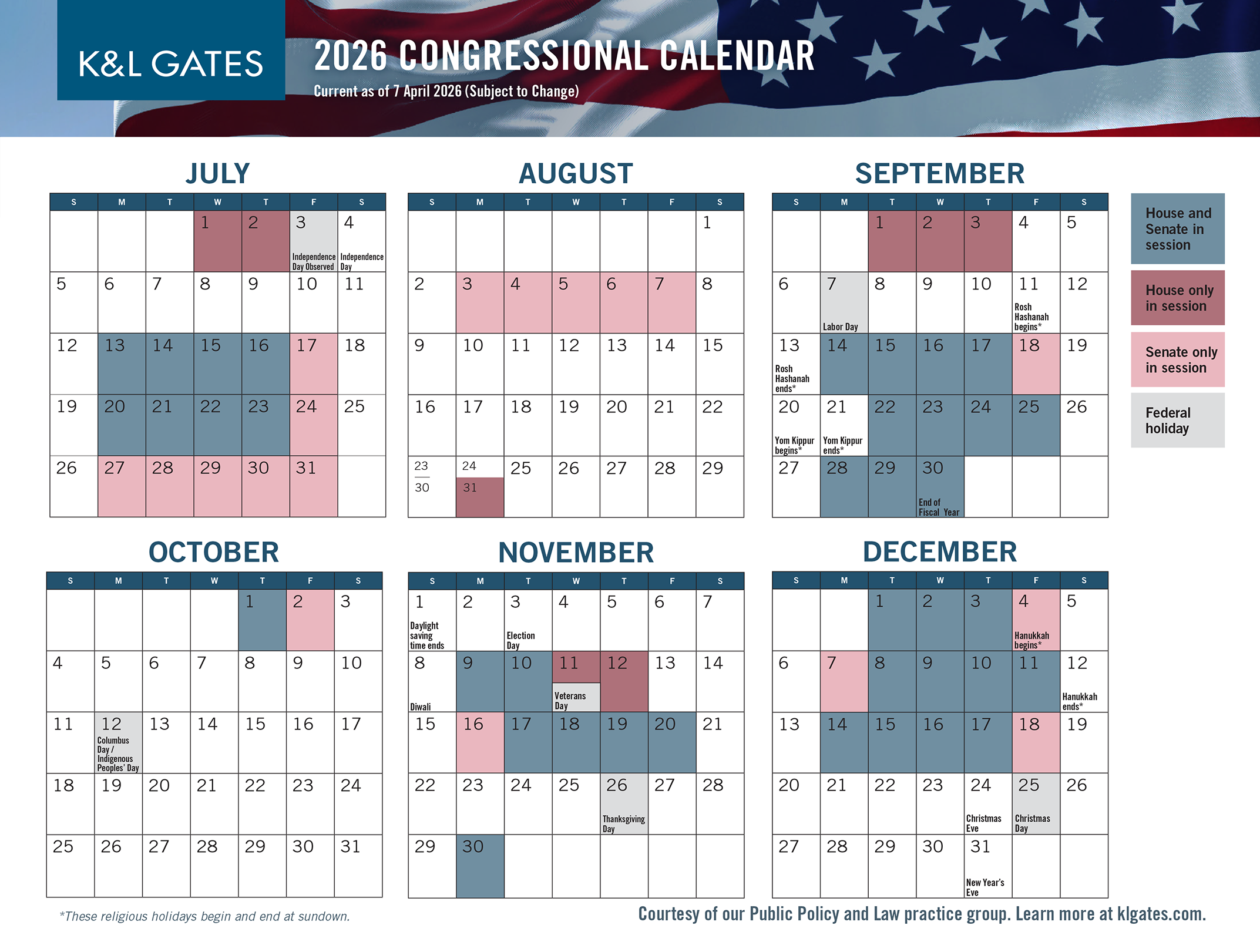
This wasn't a single-format redesign — it was maintaining one consistent visual identity across two very different mediums, print and digital, while also making the digital experience work coherently across desktop and mobile, each with its own constraints within the Ceros platform. Restructuring content built for a small trifold into something that read well on a screen, at any size, without breaking the underlying brand consistency, was the core design problem.

I led the full creative execution: designing the interactive digital experience in Ceros, building the accompanying compact printed version, and ensuring both mediums — plus desktop and mobile within the digital piece — shared a single, coherent visual system rather than reading as separate products.

The practice group was enthusiastic about the new format, and the design became the template for the calendar for the following three years.

Key Insight

“Consistency isn’t about using the same file everywhere — it’s about making the same idea work under different constraints.”

The Real Problem

The surface-level ask was “put the calendar online.” The actual problem was that the existing design had none of the properties a digital, interactive experience needed — it was built for a small, fixed, tactile format, not a variable-size screen with different constraints on desktop and mobile. There wasn’t a single fix that solved this; it required working through the layout, content structure, and interaction patterns iteratively until the piece held together consistently across every format it needed to live in, without sacrificing the visual identity that made it recognizably the same calendar.

Directional Intervention

I worked in a deliberate sequence rather than tackling all formats at once. I started with the printed piece, establishing the core visual system — typography, layout logic, iconography — in its most constrained form. From there, I adapted that system to mobile, the next-most-constrained format, making sure the identity held up at a small screen size before expanding further. Only then did I build out the final desktop layout, scaling the system up rather than designing desktop-first and trying to compress it down afterward. That order meant every format inherited discipline from the one before it, instead of each version being designed in isolation and reconciled later.

Workflow & Creative Impact

Beyond matching typography and layout across formats, I built a functional color-coding system to communicate legislative session status at a glance: distinct colors for when the House was in session, the Senate was in session, both simultaneously, and federal holidays. That system had to remain immediately legible whether someone was scanning a business-card-sized trifold panel, a mobile screen, or the full desktop layout — meaning the color logic, not just the visual style, had to survive the constrained-to-expansive build process intact. It turned a static reference calendar into something a reader could parse quickly regardless of format.
Outcome

The practice group responded enthusiastically to the new format, and the design became the standard template for the calendar over the following three years — evidence that the cross-format system held up not just at launch, but as something repeatable and durable for a piece produced annually.

Reflection

Most multi-format projects start with the most flexible canvas — usually desktop — and get compressed down from there, which is often where consistency breaks: things get cut, simplified, or reflowed as an afterthought once space runs out. I did the opposite here. Starting with the most constrained format, the trifold, forced every core decision — typography, hierarchy, the color-coding logic — to prove itself under the tightest possible limits first. By the time I reached desktop, I wasn’t stripping a design down; I was expanding a system that had already been stress-tested. Designing from constraint outward, rather than constraint inward, is a habit I still default to — it produces systems that scale up cleanly instead of ones that only survive by being trimmed.