Key Insights
When the team was out of time, the fastest path forward wasn’t a new idea. It was recognizing what had gone wrong with an old one and fixing exactly that.
Context
K&L Gates is a global firm, and a holiday message meant to reach every region carries real weight: it has to feel appropriate everywhere at once, which takes time to get right. Planning for the campaign normally starts in late July or early August, giving enough runway for messaging to move through multiple levels of approval before launch. Last year, that runway didn’t exist. By late October, no creative direction had been set, and with the holidays approaching fast, a generic video was being discussed as the fallback: a safe option that would ask nothing of anyone and deliver little in return.
The Real Problem
The real issue wasn’t the timeline. It was that creative direction for the campaign had no clear owner. Without someone positioned to set direction early, the default became risk-avoidance: a generic, safe option that asked nothing of anyone. The gap wasn’t a lack of care, it was a lack of a clear decision-maker at the moment direction needed to be set.
Directional Intervention
I didn’t wait for the generic video to fail before offering an alternative. I anticipated it. A digital, interactive experience from the previous year had performed well, and I knew going backward to a static video wasn’t the answer. I came prepared with a different option: resurface and rework a concept that had been designed but rejected in an earlier year.
The pitch combined two arguments rather than one. The underlying concept was already proven, having worked the year before, and because the design already lent itself to reused messaging, it was faster to execute than starting from scratch: speed without a quality tradeoff. That combination got a quick green light from the marketing director.
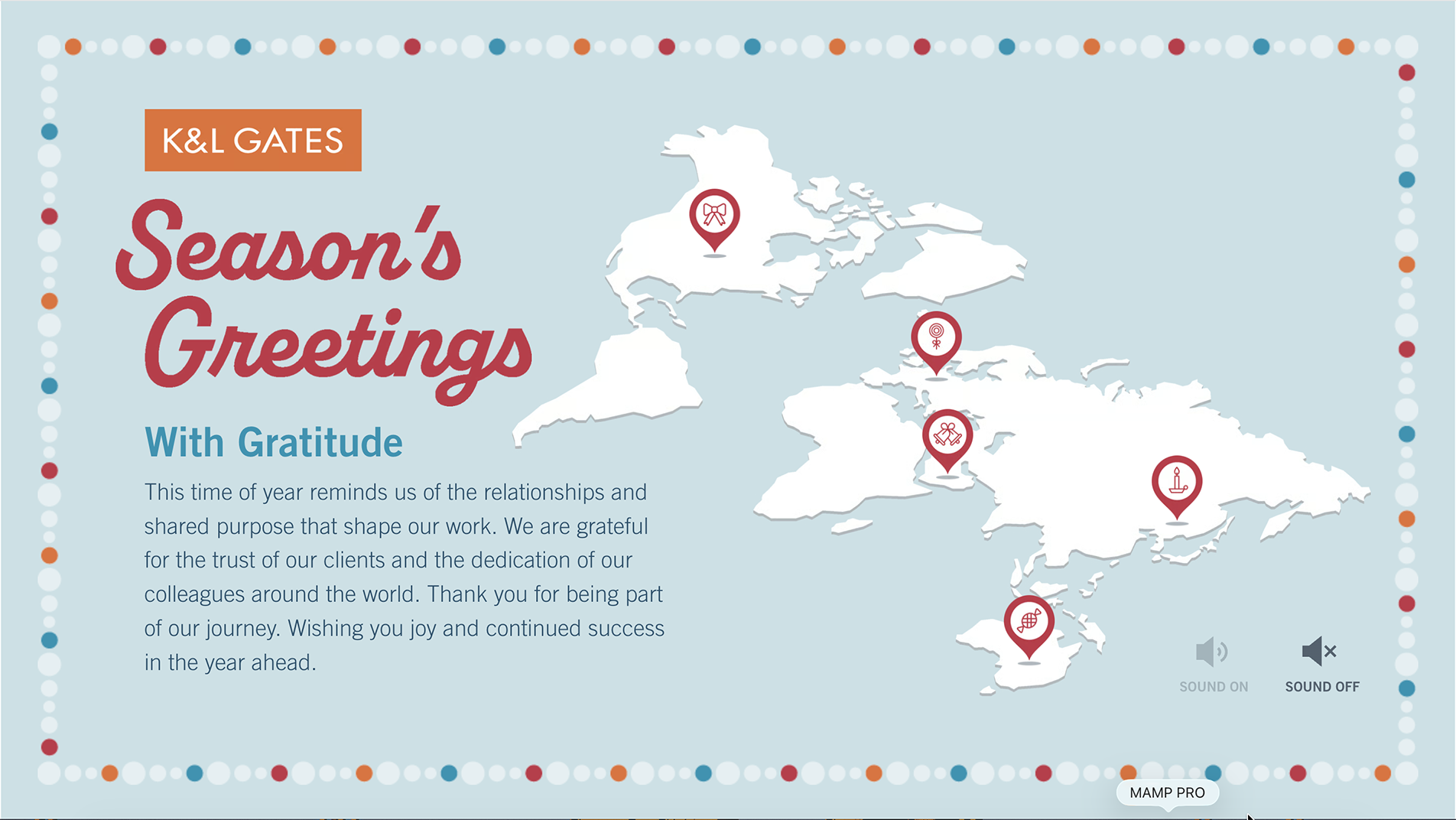
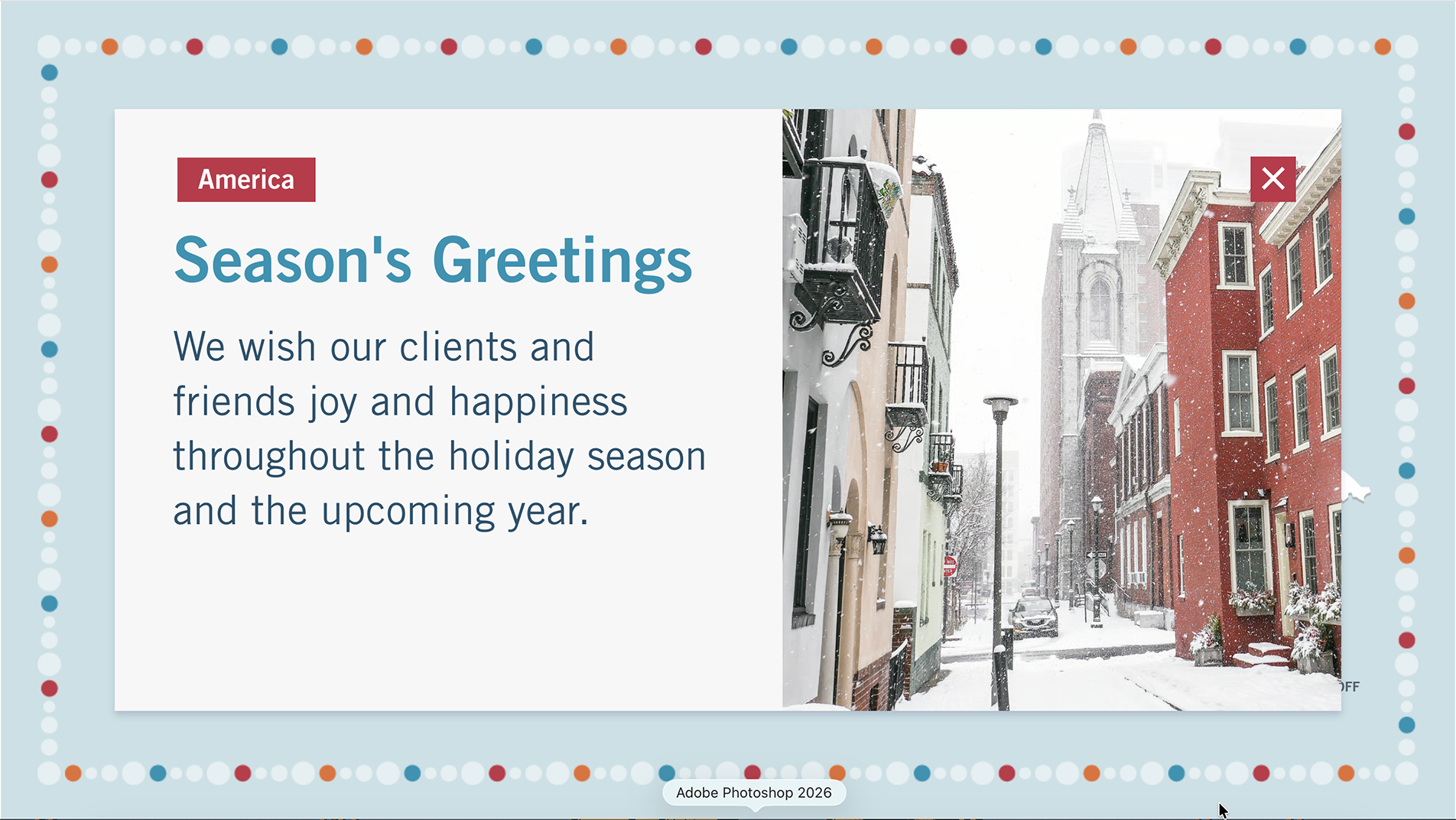
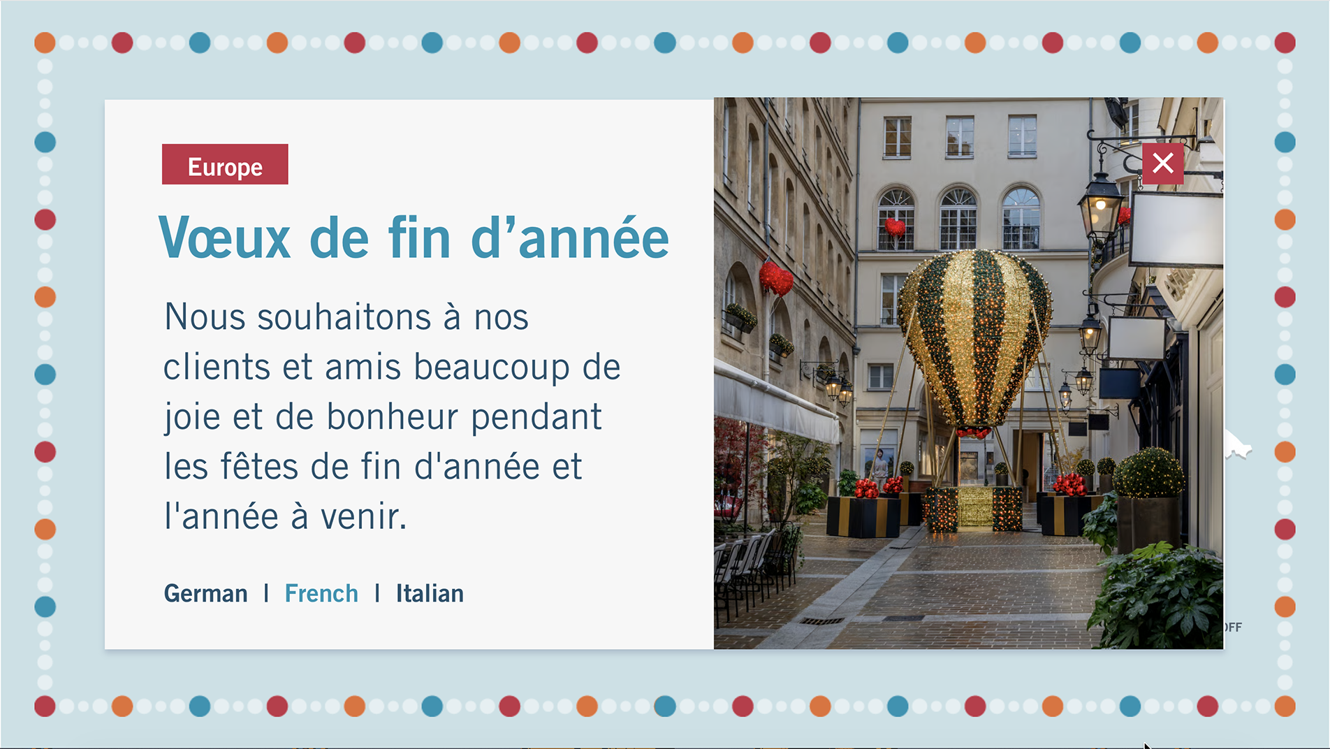
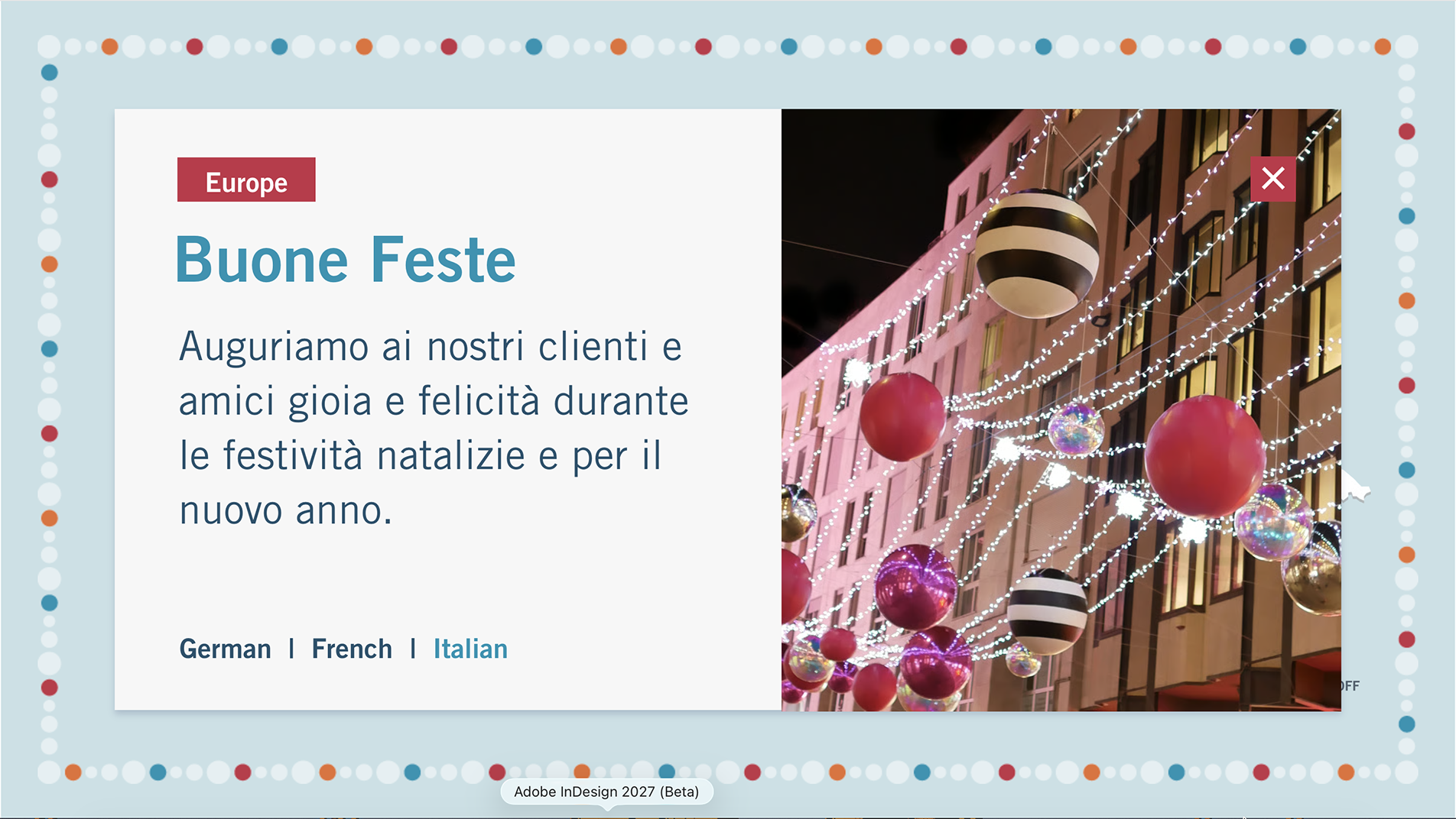
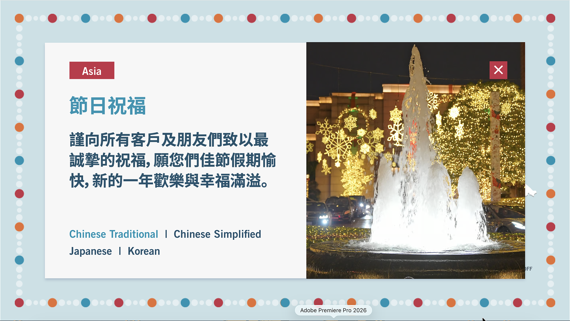
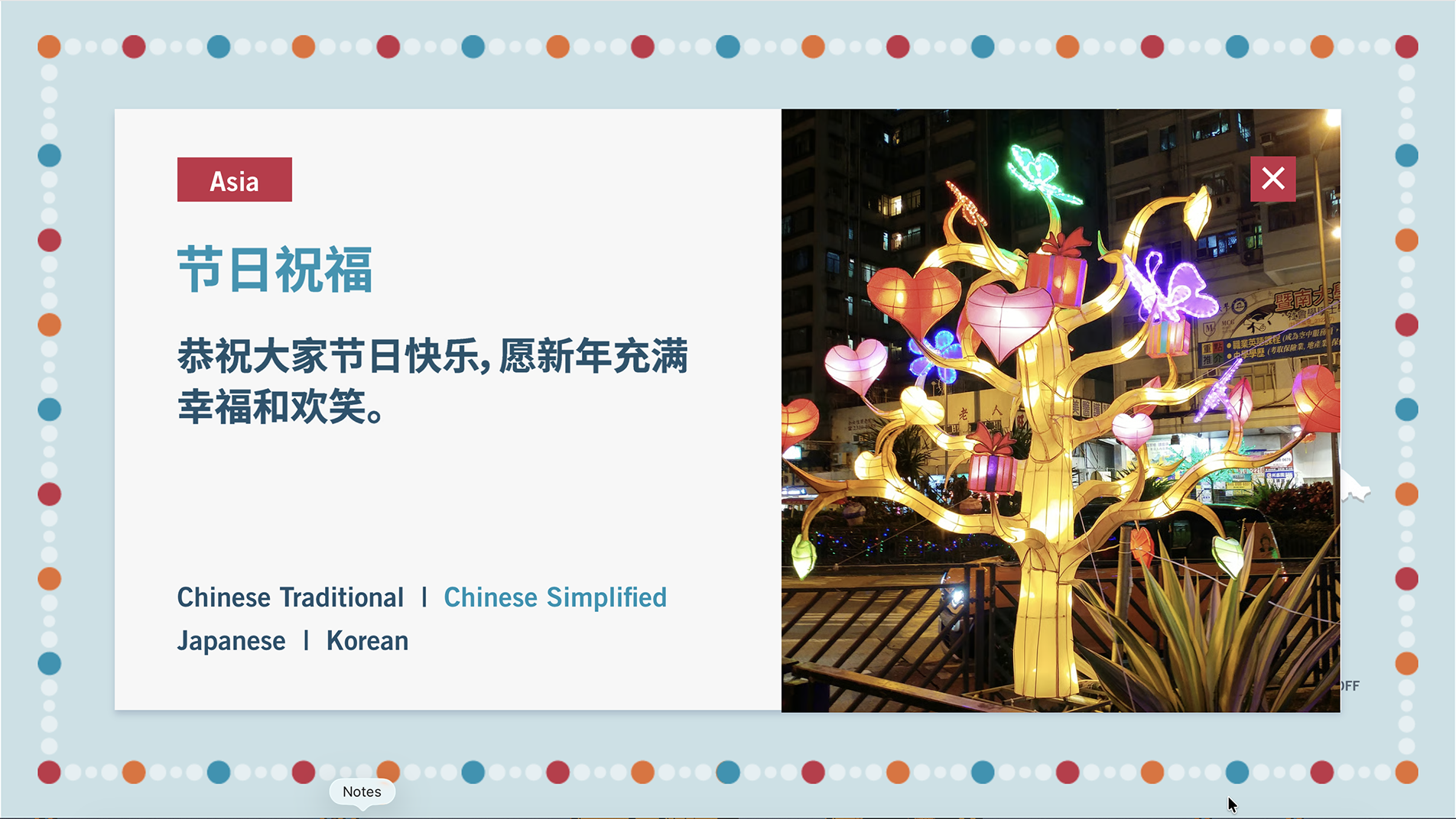
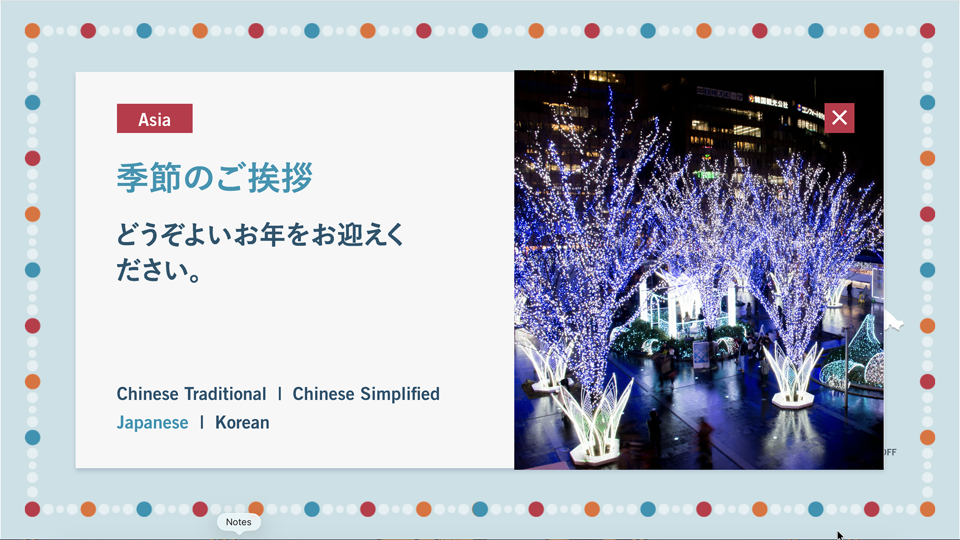
But resurfacing the old design meant confronting why it had been rejected in the first place. The original concept leaned on regional monuments and landmarks, imagery that risked favoring certain offices over others, and that couldn’t be verified for accuracy in time to launch. Rather than trying to fix the landmarks, I removed them entirely. In their place, I built a neutral icon set, with each icon functioning as a navigation marker into that region’s message rather than existing as decoration. The redesign didn’t just reduce risk, it replaced a purely decorative element with one that did a job the original never had.

Creative Impact
Nine years of building these campaigns had already taught me to design the core interactive experience with its downstream formats in mind, not as an afterthought. Because the icon system, color palette, and border design were built to extend cleanly, adapting the core experience into a website widget, a social media image, ecomm graphics, and later, MS Teams video backgrounds, was straightforward rather than a separate design effort each time. The Teams backgrounds weren’t even part of the original scope; leadership requested them after launch, having seen how well the border design translated on its own. The system held up under a use case nobody had planned for.
Outcome
The redesigned campaign cleared every level of approval, from each regional managing partner to the global managing partner, with minimal changes to copy and almost no changes to design. It shipped without the pushback that holiday campaigns at the firm have drawn in past years; no office raised concerns, for the second year running.
Performance backed up the reception: the page averaged 41 visitors per day, up from 30 the year prior (a 37% increase), with average engagement time up from 26 to 33 seconds (a 27% increase). Beyond the numbers, the project shifted what the organization now expects: a generic fallback video is unlikely to be back on the table.




Reflection
Institutional memory is often treated as something to move past; the instinct under pressure is always to start fresh. But nine years in, I’ve learned that the past isn’t a constraint to escape, it’s a resource to interrogate: what failed, why it failed, and whether the reason it failed still applies. Good design leadership isn’t always about generating something new. Sometimes it’s about being the person who remembers enough to know a good idea just hadn’t been executed correctly yet.