Key Insight
The best stories aren't told alone — they're built by knowing what to keep and trusting someone else to help you see it.
The Real Problem
The surface-level ask was "build an interactive history timeline." The actual problem was that with a full year of programming depending on this piece as its centerpiece, it had to work harder than a typical retrospective: compelling enough to justify being referenced across a 5K, webinars, and a gala; honest enough to earn credibility with an audience that had lived through some of that turmoil firsthand; and structured well enough that two very different inputs — raw historical research and narrative judgment about what mattered — came together as a single, coherent voice rather than reading as a list of facts.
Directional Intervention
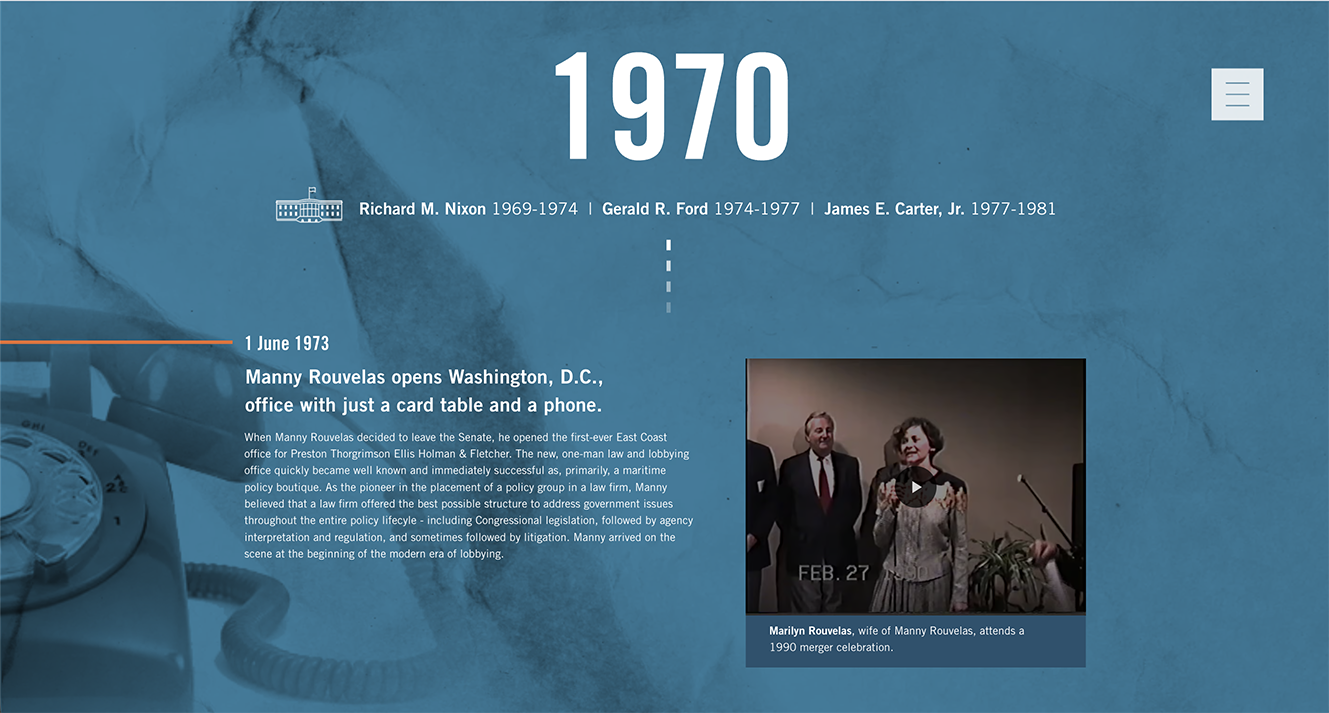
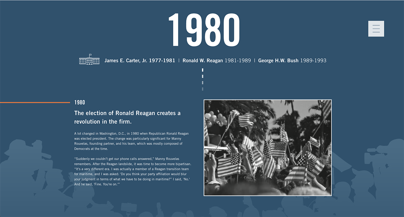
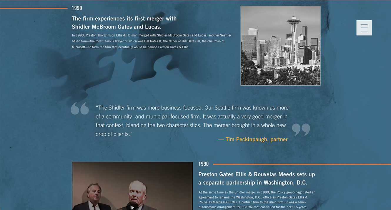
I structured the timeline by decade, placing each achievement and moment of turmoil in chronological order within that structure — giving the viewer a scaffold that made 50 years navigable instead of overwhelming. Within that decade-by-decade frame, I specifically called out pivotal moments rather than treating every entry with equal visual weight, so the story had rhythm: quieter stretches of context punctuated by the moments that actually mattered. That combination — chronological grounding plus deliberate emphasis — let the timeline hold both the hard periods and the wins side by side without either one overpowering the other.
Workflow & Creative Impact
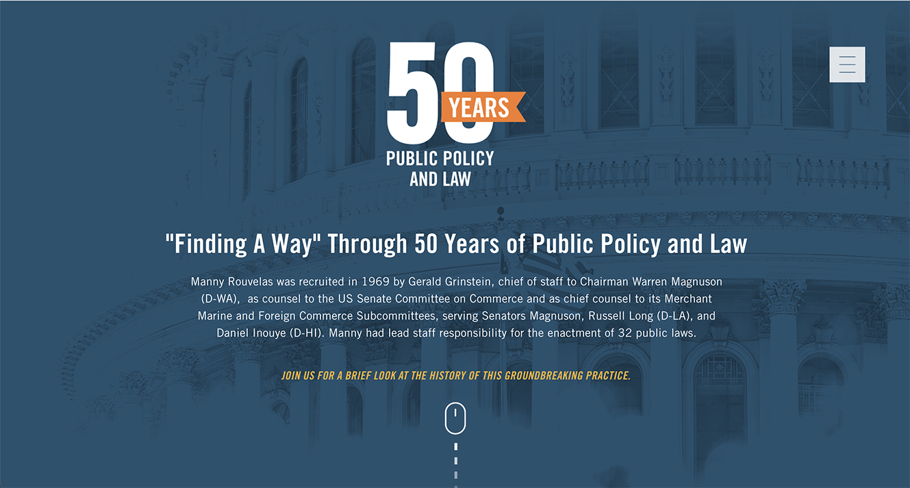
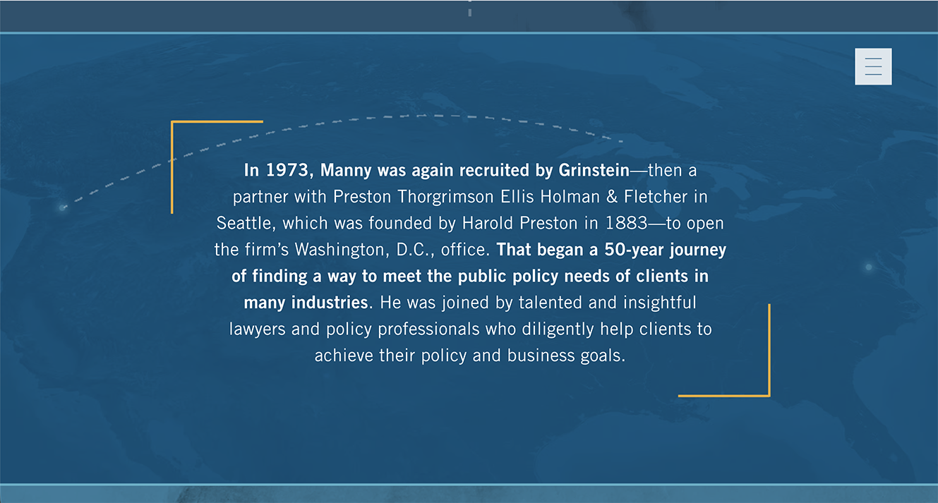
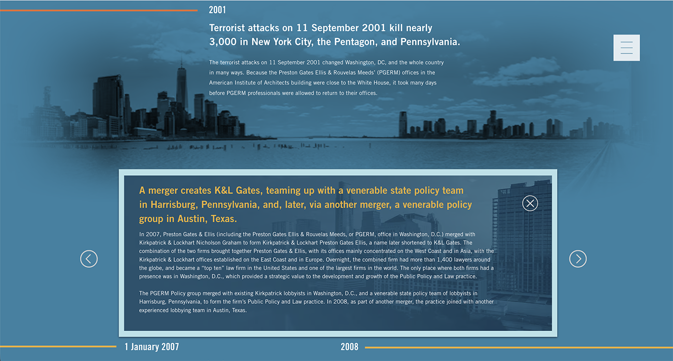
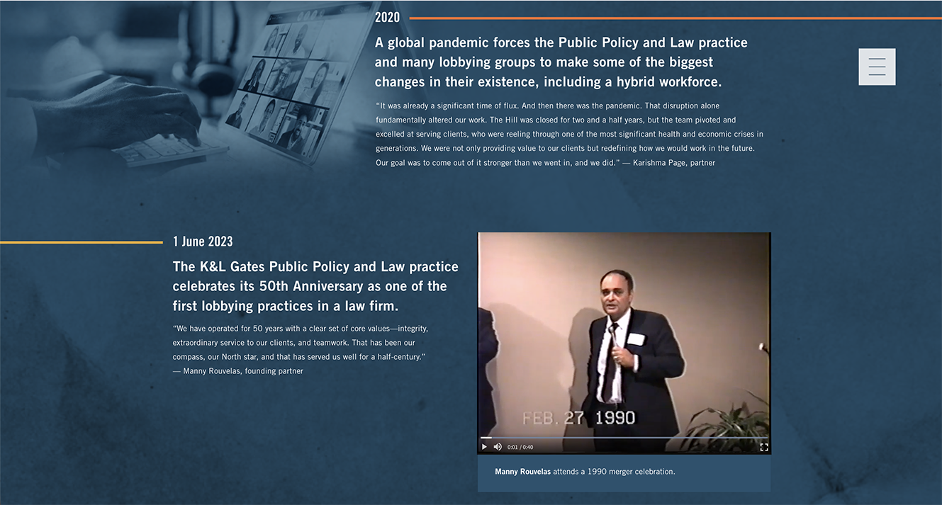
The visual system was built to carry the tone as much as the content. I used the firm's dark blue heavily as a background to create sharp contrast, with yellow and orange reserved for highlighting content and creating movement — directional bars that slide in as the viewer scrolls, pointing toward each new piece of content and giving the timeline a sense of forward motion rather than static reading.
Imagery was a genuine constraint — photography from each decade was hard to source — so I proposed a workaround: instead of relying on scarce archival photos, I anchored each decade in recognizable landmarks, current events, and common office objects from that era. A rotary phone signals the 1970s; the Watergate Hotel marks the Reagan-era section; a subtle nod to a Zoom call closes out the 2010–present era. These details did the work photography couldn't, giving each decade a visual identity a viewer could place instantly.
Where stories were grouped together, I built a dedicated navigation system so viewers could move laterally between related content without being forced back to the main scroll to move forward — keeping related history connected rather than scattered across a single linear path. Underneath all of it was a 12-column grid, the structural decision that held the whole piece together and let every other choice — the color system, the imagery, the navigation — sit consistently across 50 years of content.