Key Insights
A disagreement is seldom about format. It’s about which audience each person is protecting.
The committee disagreed about print versus digital. They were arguing, without saying so, about who this publication was for — and once the work served both audiences, there was nothing left to argue about.
Context
For The Public Good is the firm’s annual account of its pro bono work. It matters internally as recognition for the attorneys who do the work, and externally as evidence of the firm’s values to clients and recruits.
Because the publication had lapsed, reviving it meant more than restarting production. It meant deciding what a pro bono report should be after several years of silence, in a communications environment that had changed around it. The committee had strong opinions and no shared direction.
The Real Problem
The surface request was a refreshed report. Three problems sat underneath it.
The direction was contested. Some committee members wanted the printed publication preserved. Others wanted stories released as they happened, in a continuously updated hub. Both positions were defended on their merits, and neither side moved.
The disagreement was unnamed. Each camp was designing for the audience it knew best. The members closest to clients and peers valued a tangible artifact — something durable that could be handed over or left on a table. The members closest to digital channels valued reach, timeliness, and the ability to share a single story on its own. Neither was wrong. But because the underlying difference was never stated, the conversation stayed stuck on format, which is the one thing they could argue about indefinitely.
The program had no visual identity of its own. The firm’s pro bono work was presented in whatever form each piece happened to take, with no consistent recognizable expression tying it together across contexts.
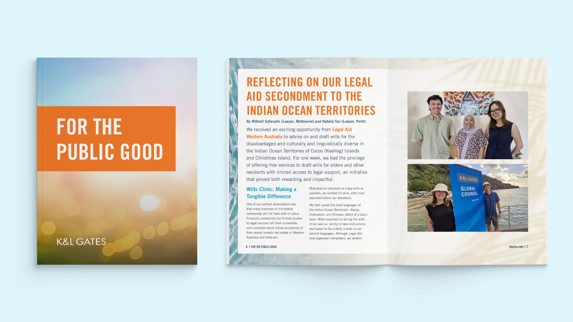
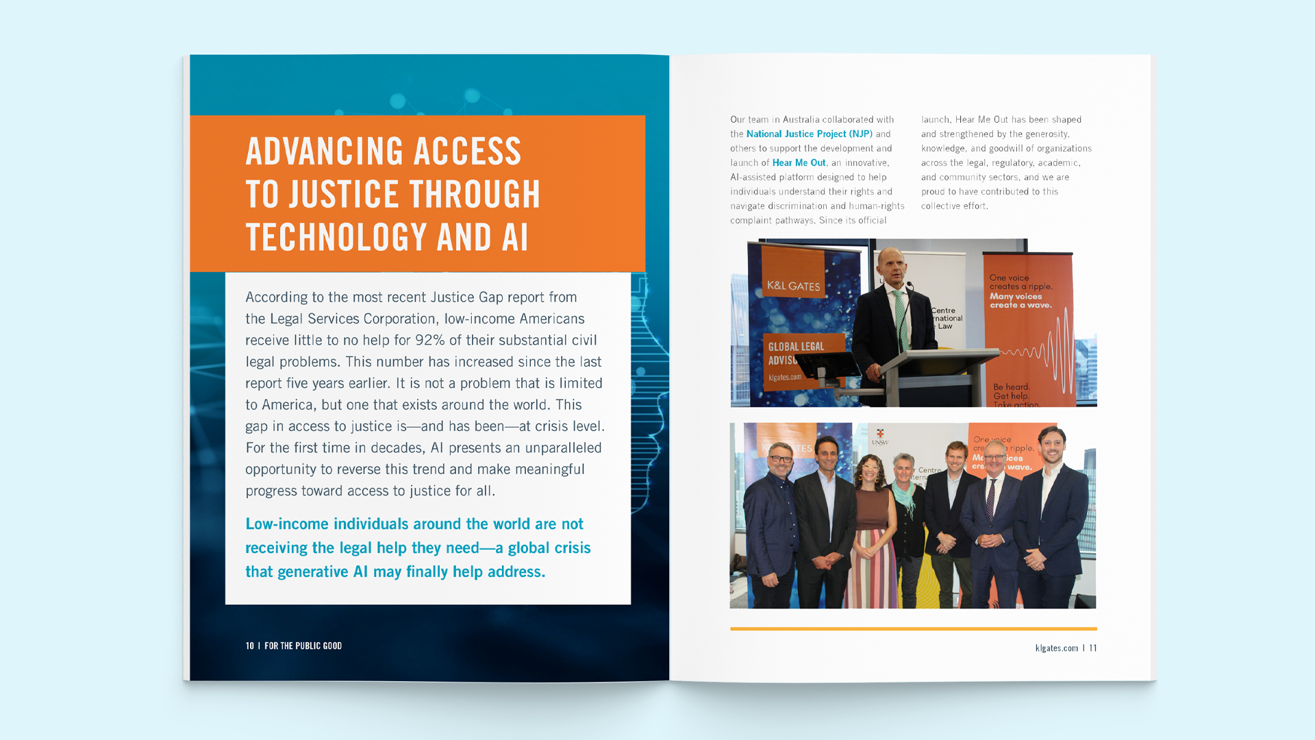
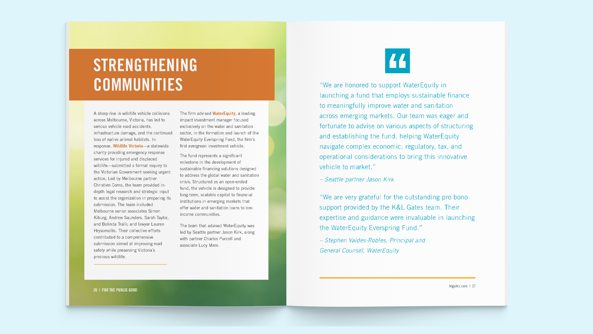
Directional Intervention
I did not argue for a format. I built one.
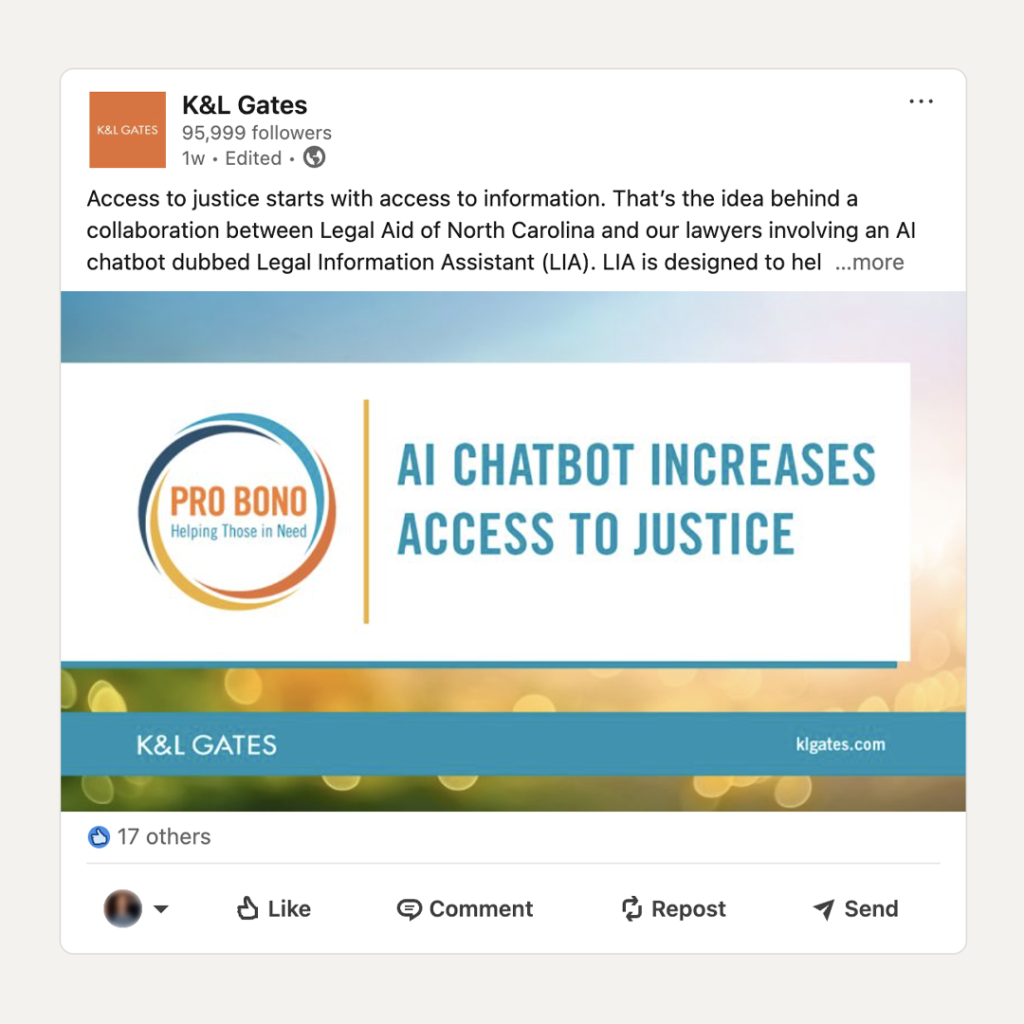
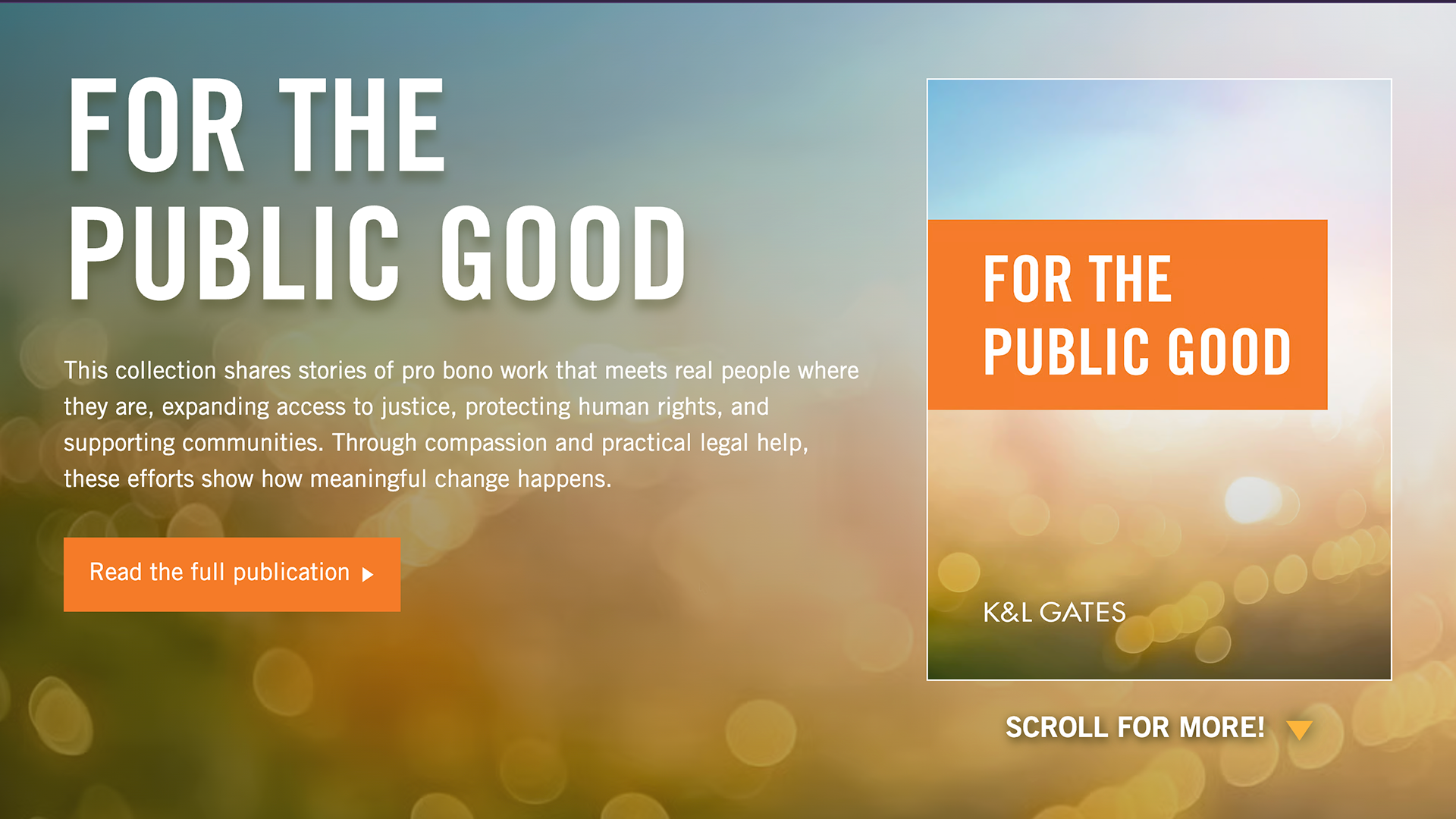
Rather than presenting options for discussion, I brought the committee a rough draft of the new publication, a plan for an interactive landing page, and the social graphics that would carry it — a downloadable PDF and a digital experience, treated as one integrated release rather than competing alternatives.
This reframed the decision. The choice was no longer print or digital, so no one had to concede. The members who wanted a lasting artifact got one. The members who wanted reach and shareability got that too. The committee approved the concept with only minor changes.
The deeper move was showing rather than proposing. A resolved concept ends a debate that an open question keeps alive.
Alongside the publication, I developed the pro bono identity — a mark, color palette, and supporting imagery — designed to give the program a distinct and recognizable presence while sitting correctly inside the firm’s master brand. The constraint was the point: the identity had to read as the firm’s pro bono work, not as a separate brand operating next to it.
System Impact
The most durable outcome was not the design. It was the agreement about what stays fixed and what is free to change.
The committee accepted a clear separation:
- The process is fixed. Every edition consists of a full PDF layout, an interactive landing page, and supporting social graphics.
- The design is flexible. Visual direction, art, and structure can evolve edition to edition without reopening the format debate.
This is what keeps the work from depending on me. Future editions inherit a decision model rather than a template, which means the next designer can make different creative choices without the committee having to relitigate what the publication is.
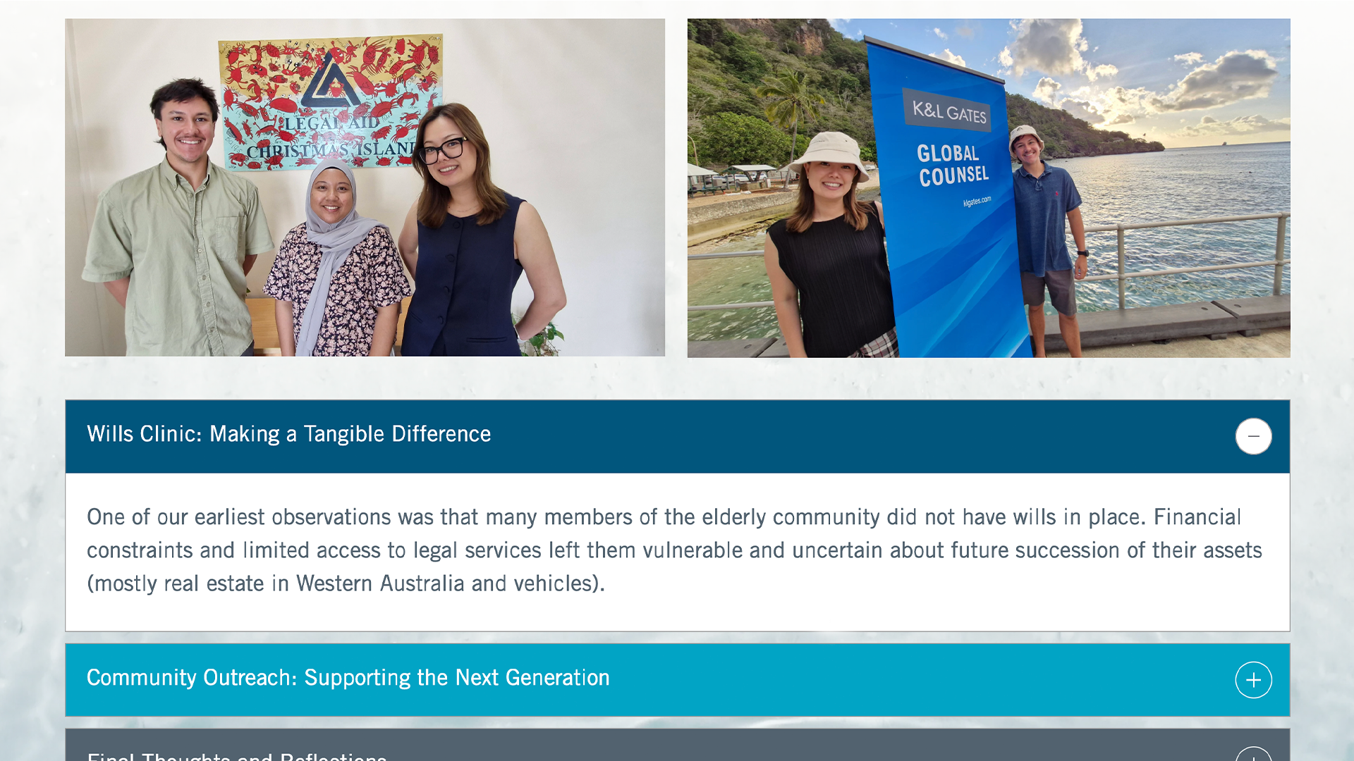
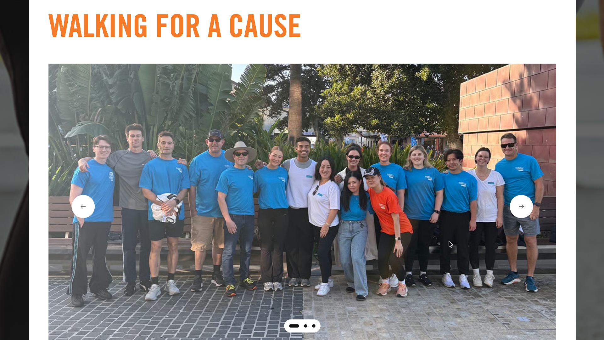
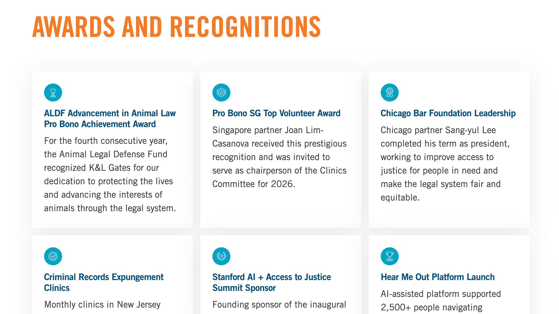
The landing page carries the same logic. It breaks the report into smaller, digestible pieces revealed through interaction rather than reproducing the PDF on screen — a different reading experience for a different context, drawn from the same body of work.
It also does something the printed artifact structurally cannot: it produces evidence. Engagement data will show which stories people actually read and share, which means next year’s editorial priorities can be shaped by observed interest rather than by whoever argues most convincingly in the room. The digital layer didn’t just serve a second audience. It gave the committee a way to make better decisions.
Outcome
Thirty days after launch.
- The chair of the Pro Bono Committee reached out personally to thank me and singled out the landing page.
- Committee members are already planning the next edition, working from the agreed process.
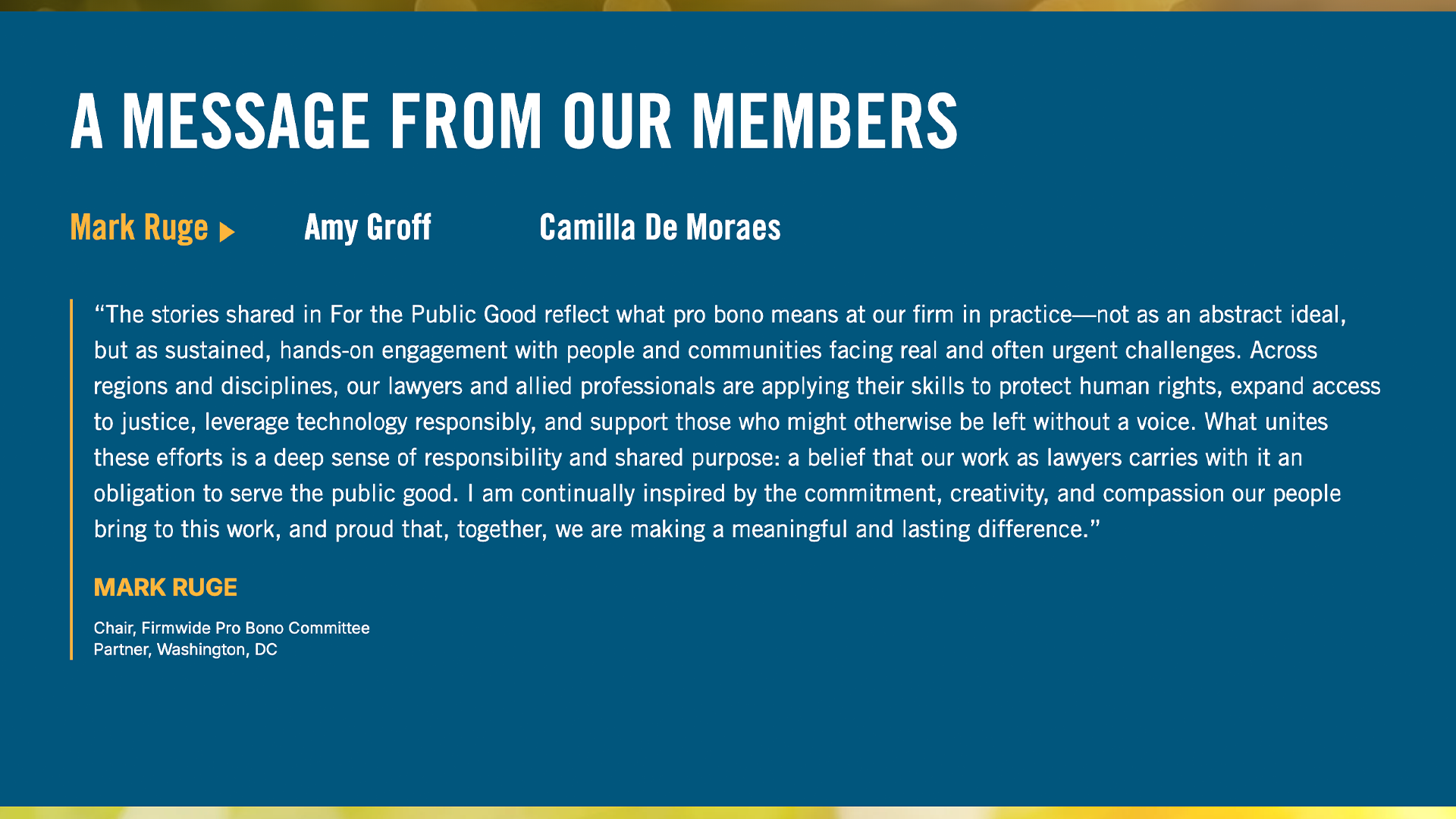
- The firm is investing in reception-area table signage across every office, carrying QR codes that direct visitors to the landing page.
That last point is the clearest measure of alignment. The committee members who had advocated for print are now funding the physical distribution of the digital experience. The disagreement did not end in compromise; it ended in a shared position.
Quantitative engagement data will be reviewed at ninety days.
Reflection
The hardest problem on this project was never visual. It was that a group of capable people were describing different goals using the same vocabulary, and the conversation could not move until something existed for them to react to.
I’ve come to think that a large part of design leadership is knowing when discussion has stopped producing clarity, and when the most useful thing you can do is build the thing that makes the disagreement unnecessary. Direction is more persuasive than argument.
The other lesson is about what you leave behind. A good design solves this year’s problem. A good structure means the argument doesn’t have to happen again.