Key Insights
One good year can be a fluke. Getting picked five times over a decade is a track record.
The Real Problem
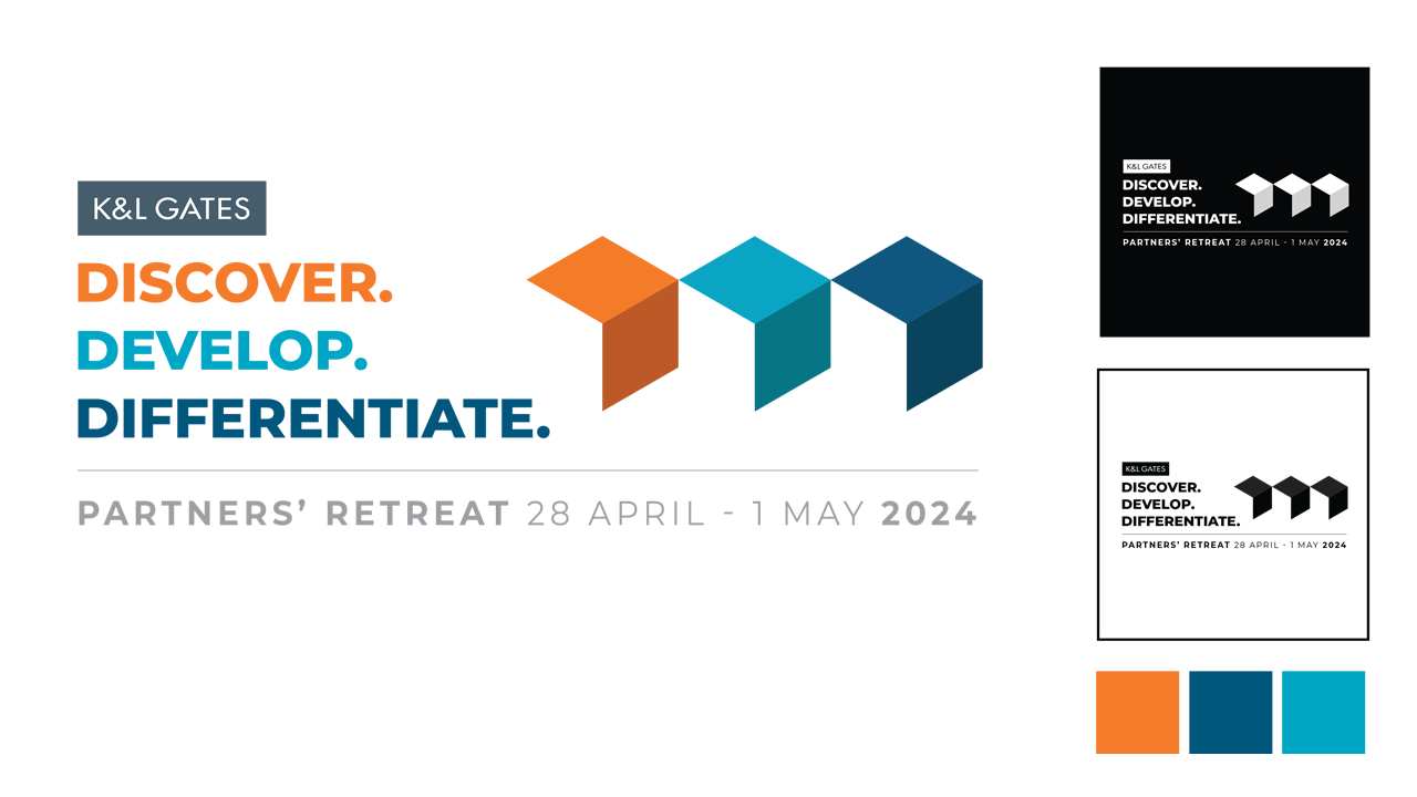
The surface-level ask was "design an identity for the retreat." The actual problem was translation: a conceptual theme like "Discover. Develop. Differentiate." is open to many legitimate visual interpretations, and whichever direction I chose had to hold together across formats as different as a t-shirt, a slide deck, and venue signage — without fragmenting into a set of loosely related pieces that happened to share a color palette.
Directional Intervention
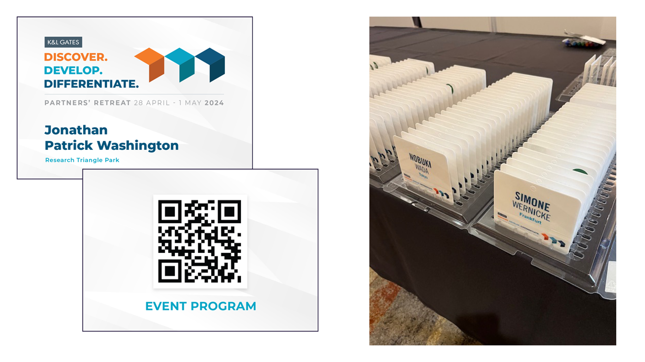
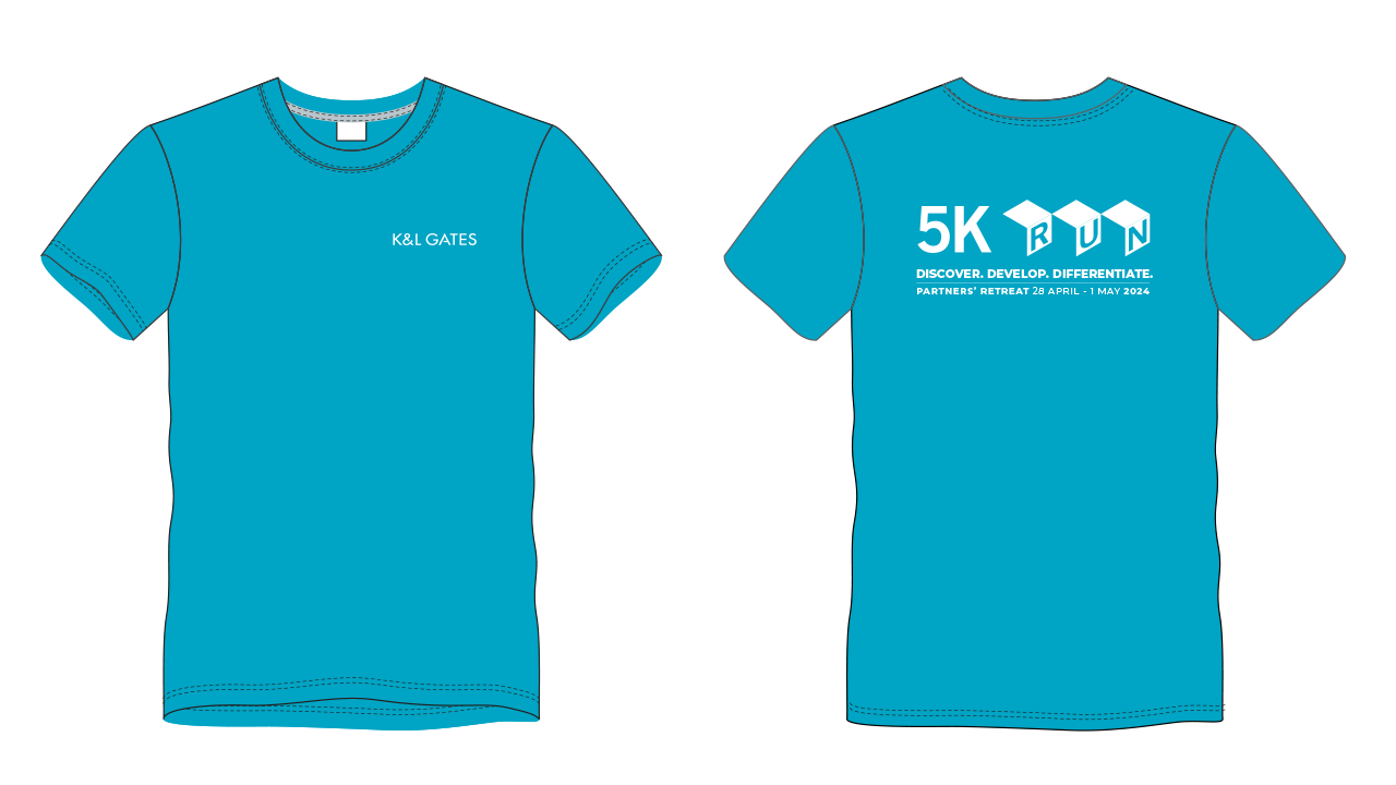
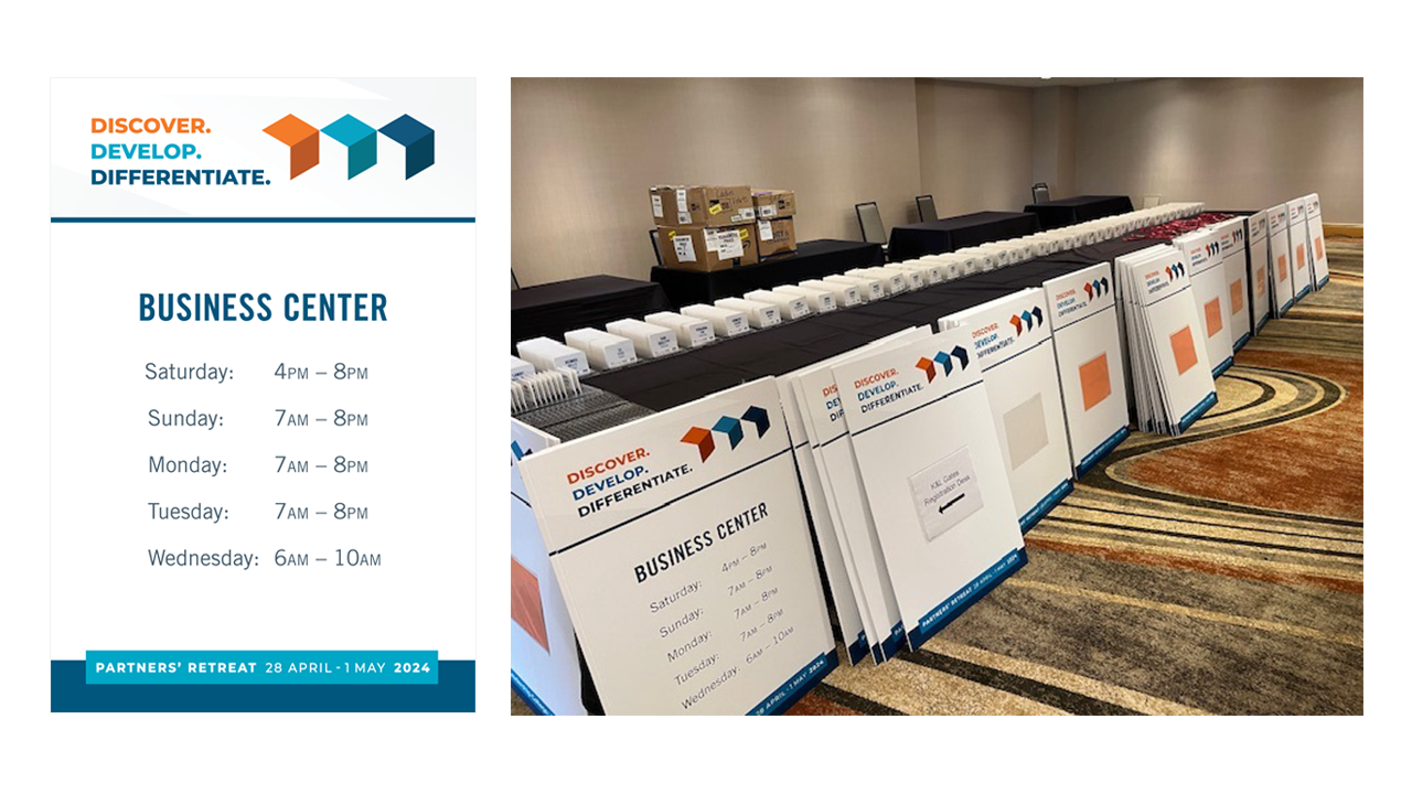
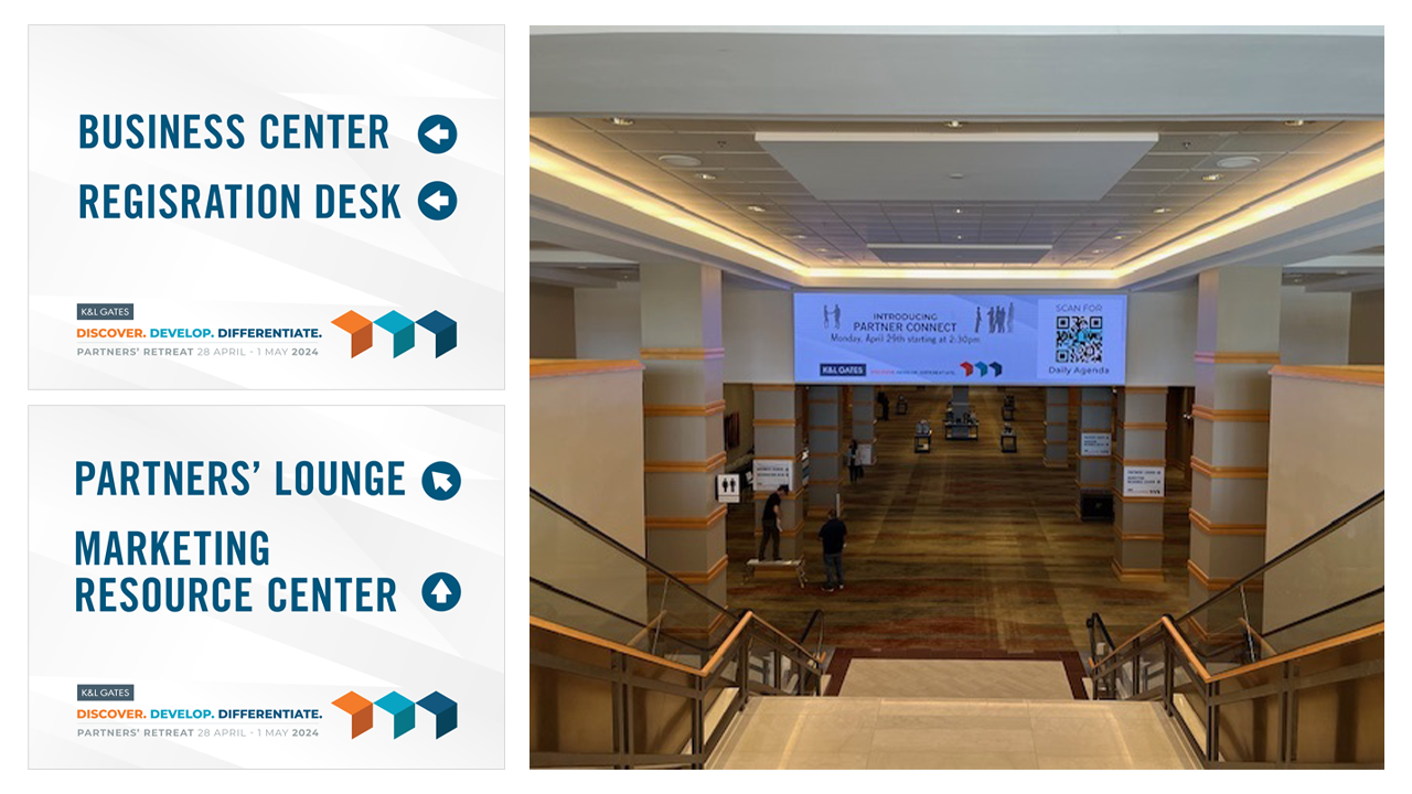
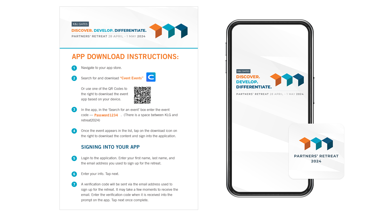
I started by establishing the foundation: a logo lockup, color palette, and imagery direction built specifically around the theme. That core system became the conference brand guide everything else had to answer to — the slide deck, badges, signage, apparel, and map weren't designed independently and reconciled after the fact; each one was built by applying the same established system to a new format's constraints. That sequencing kept eight-plus deliverables visually unified without requiring constant cross-checking between pieces.
System & Creative Impact
The brand guide went beyond a palette and logo — it defined exactly how the logo could be scaled or cropped depending on format, a clear typography hierarchy, and a consistent imagery and iconography style. Those rules meant the identity could survive wildly different applications, from a small badge to large-format venue signage to a printed 5K shirt, without anyone (including me) having to make ad hoc judgment calls on each new piece. The guide did the work of keeping the system intact; execution just applied it.
Outcome
The 2024 identity was well received across the event, consistent with a broader pattern: over a decade, my design was chosen for the retreat 5 of the 8 years it actually took place (accounting for one year the partners paused it and one year it didn't happen due to COVID-19). That consistency suggests the system worked because of process, not luck — a foundational brand guide applied disciplined structure to a new theme each year, format after format.
Reflection
Every year, the brief is different — a new theme, a new set of formats, a new set of constraints — but the process stays the same: build the foundation first, then let every deliverable inherit from it. That discipline is what makes a system trustworthy enough to reuse a fifth time, not just a first. Abstract themes will always be open to interpretation; the job isn't to eliminate that ambiguity; it's to resolve it once, clearly, and let that resolution carry the weight across every format that follows.